Designing Mastodon: help people find their way back to their account
People were creating Mastodon accounts, then forgetting which server they'd joined. They remembered joining Mastodon, but that name wasn't enough to get them back to their account.
Mastodon is a social network made up of independently run servers. Choosing one gives a person a home for their account, while still letting them connect with people elsewhere in the network. For someone arriving from a service with a single login address, that extra distinction can be easy to miss.
We worked with founder Eugen Rochko on the new-user experience, starting with the emails that reach people outside the app. Prakash Ghodke designed the templates, with my direction and review. The work extended from welcoming a new account to notifications, security messages and desktop onboarding.
Make the server part of the welcome
A generic welcome would reinforce the Mastodon name without helping someone remember where their account lived. We made the server visible in several parts of the email: beneath the Mastodon logo, inside the welcome heading and on the server card beside it.
The card gives that information an action. Its Sign In button sits with the server's own name and description. A person opening the email later has both the reminder and a route back, without first having to recall the address.

The repetition is deliberate. These are small, familiar places to look while reading a welcome email. The address isn't left in a footer that someone might never reach, and the person doesn't have to read an explanation of federation before recognising the place they joined.
the server name sits beside the route back into the account
We carried the context into the transactional templates too. The verification message names the server on which the account was created. Its button completes that specific task, while the surrounding identity remains consistent with the welcome.

Give the notification enough context to be useful
The transactional emails needed more than a visual refresh. I asked Prakash to make them engaging enough to encourage a return to the app, with colour and illustration, and to give every message a useful action. Sometimes that could be as simple as Open Mastodon.
A new-follower notification shows the account that followed you, with its profile image, description and statistics. The View Profile button takes the person into that account. The message can answer who it is before asking for a click.

The same structure changes with the event. A favourite notification contains the post. A follow request offers a route to manage requests. A completed archive export gives the person a download. We kept the system recognisable while making the content and action specific to the reason the email exists.


Eugen caught a problem in an early version: the title above a card and the title inside it were saying the same thing. Removing that duplication made the hierarchy clearer. The heading could identify what happened, with the card supplying the information and action the person needed next.

A security message has to distinguish a request from a change
A password-reset request and a changed password can look similar in an inbox, but they mean different things for the account holder. The reset email explains that the password won't change until they use the link to create another one. If they didn't request it, the message tells them they can ignore it.

The changed-password notification describes an event that has already happened and directs someone who didn't authorise it towards account settings or the server administrator. Those messages share a visual pattern, but their instructions have to reflect the different states.

Two-factor authentication has a similar distinction. Enabling it is a confirmation; disabling it changes how the account can be accessed. The disabled message uses a red lock icon and states that login is now possible with email and password alone.


the message explains what changed about access to the account
Design for the email someone can actually receive
The templates also had to survive email clients. During review I ruled out an early graph treatment because of the implementation limitations we were working within. A design that depended on it would promise an experience the delivered email couldn't support.
Shadows presented a less obvious version of the same problem. Several cards relied on a shadow to separate them from the background. I asked for a regular border as well, so the card wouldn't lose its boundary when the shadow wasn't rendered.
We also checked phone layouts. My brief was to keep the desktop padding compact enough to work at a narrower width, without depending on separate breakpoint treatments for padding and alignment. That constraint affected the desktop design from the start rather than becoming a mobile correction at the end.
We assembled the typography, colours and controls into an email design system. Mastodon had asked for help tidying its wider system; this gave the email work a consistent set of parts, including buttons and checkboxes, for later templates to use.
Ask for the information a new account needs now
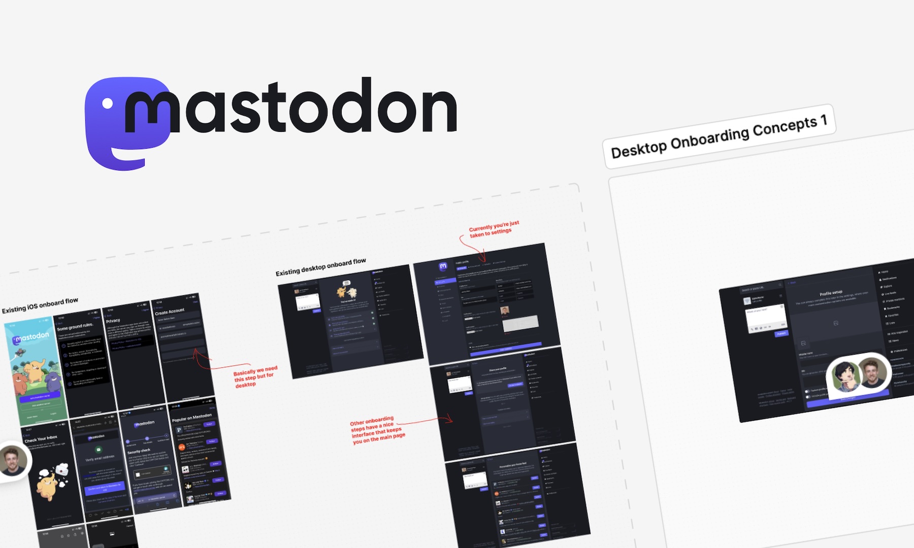
The desktop onboarding work brought us back inside the product. I ran workshops with Eugen and the development team to explore the sequence and the profile information people were asked to provide.
Eugen brought findings from user testing: people didn't initially understand the label-and-content inputs used for profile fields. He proposed leaving them out of the first onboarding. He also pointed out that asking a new user whether they wanted an automated account wasn't necessary at that stage, while the choice to make their account discoverable and searchable did matter.
We revised the design around that guidance. The goal was to let someone establish their account and make the consequential early choices without asking them to understand every profile setting at once. The specialised fields could wait until the person had more context for using them.
Our email work gave the team templates for those early interactions and the messages that follow them. The handoff also included the shared styles and controls, so a new notification could use the same structure, with its own explanation and a direct route to the relevant part of the account.

The erasure of deep work

The moats left in SaaS
How we design and build software has changed forever
I Was Awarded a UK Global Talent Visa
After the Interface: Rethinking Design for a World of AI Agents
Hill Has Been Accepted Into The HF0 Residency

Joining Hill As Head of Product
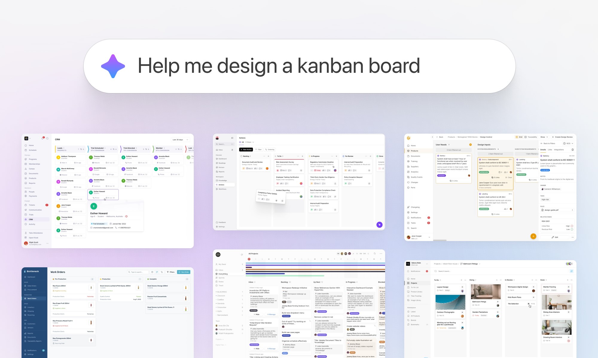
We turned 10 years of product design expertise into the ultimate AI design copilot

Breaking into UX & Product Design: A Guide for New Designers
Adding 'flexible features' to uncover new product opportunities

Pushing Through Creative Block: Learning from Artists and Musicians to Reignite Inspiration

Unlocking Airbnb’s Secret: How SaaS Founders Can Aim For 10 Stars And Win

How to avoid MVP feature creep: The ICE Method
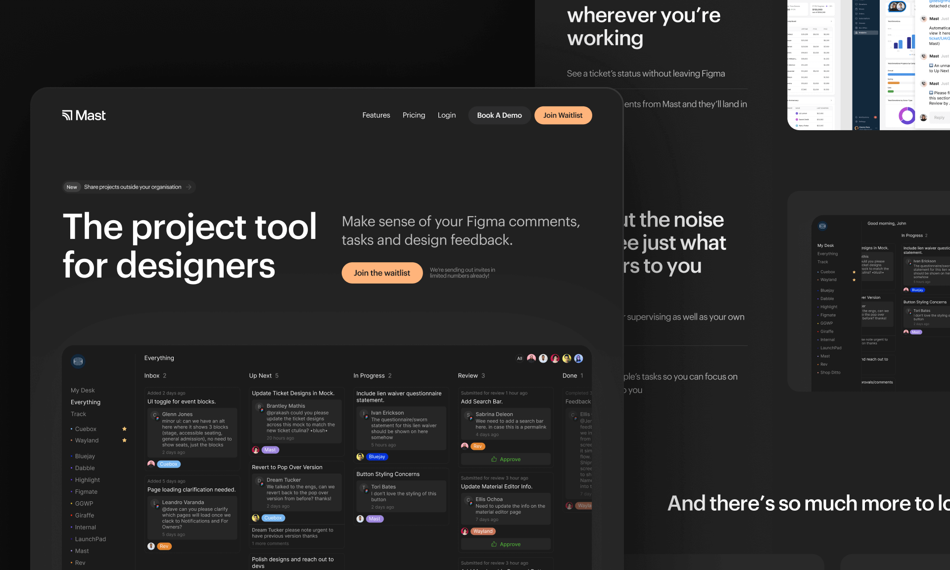
Introducing Mast: The project tool for design teams

Reflecting on my time running a 100-person creative community in the heart of Melbourne
Starting a company during a global pandemic, with Jeremy Blaze on Funemployed
Introducing NOOK: Digital Patron Check-In & Menus to Keep Australia's Hospitality Industry Afloat
Why I’ve started a product design studio
Case Study: Making sense of LIVE carpark availability in UbiPark
Case Study: Embark’s design, launch & early iteration
Enpose has been acquired by ApiLayer, solidifying their position in the screenshot API market
An exercise in reductive design: Building a beautiful API