Case Study: Embark’s design, launch & early iteration
Introduction
Embark is a public transit utility which works in over 1,200 cities around the world. It was built to be a simple and easy to use tool for public transport users. For this reason, a strong emphasis was put on creating a streamlined and intuitive user experience.
My role at Embark was User Interface Designer. I worked inside the Contact Light team which consisted of myself, a director / UX specialist, 3 developers (middleware, iOS and Android), and our CEO.
Note: I don’t claim sole ownership over Embark’s design. It was the result of many hours of collaboration with the entire Contact Light team.
Part 1: Design, user testing and releasing v1.0
As with many startups, we started out with an iPhone app and it was during the creation of this that most of the ideation and user testing took place. When I joined the team, some rough designs and an even rougher prototype app had already been made.
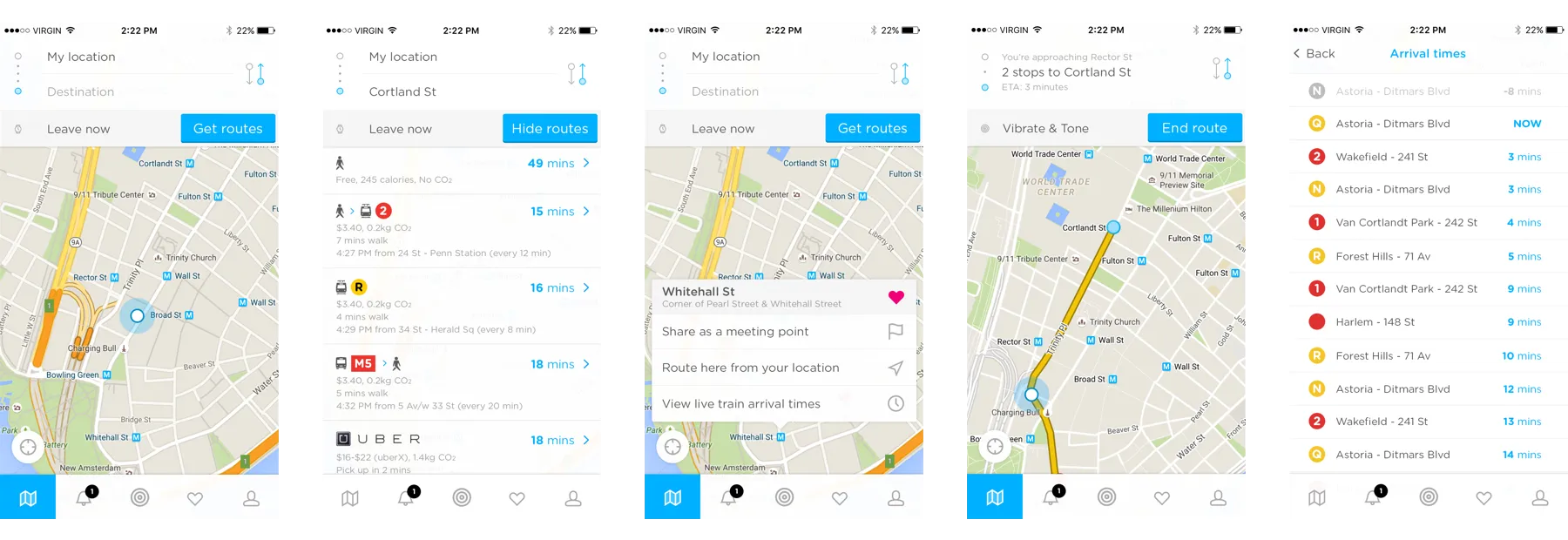
Version 1 of Embark was released in May 2016 after a few very busy months of work by both the design and dev teams. We didn’t promote this first release at all, but instead sent links to friends and began conducting user testing immediately.

We used UserTesting.com to get an insight into how the app held up to human use. We found a number of common issues from the people who tried the app and quickly went back and rectified them. These changes made up our next release which included…
- Live times
- Press-and-hold to drop a pin and get directions
- New, clearer iconography
- Improved readability and contrast
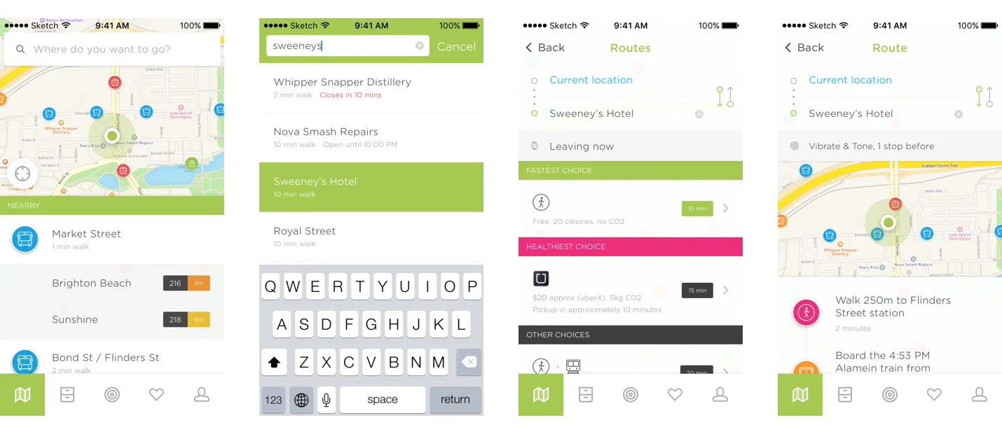
After repeating this cycle a few times, in a few short months we had this…
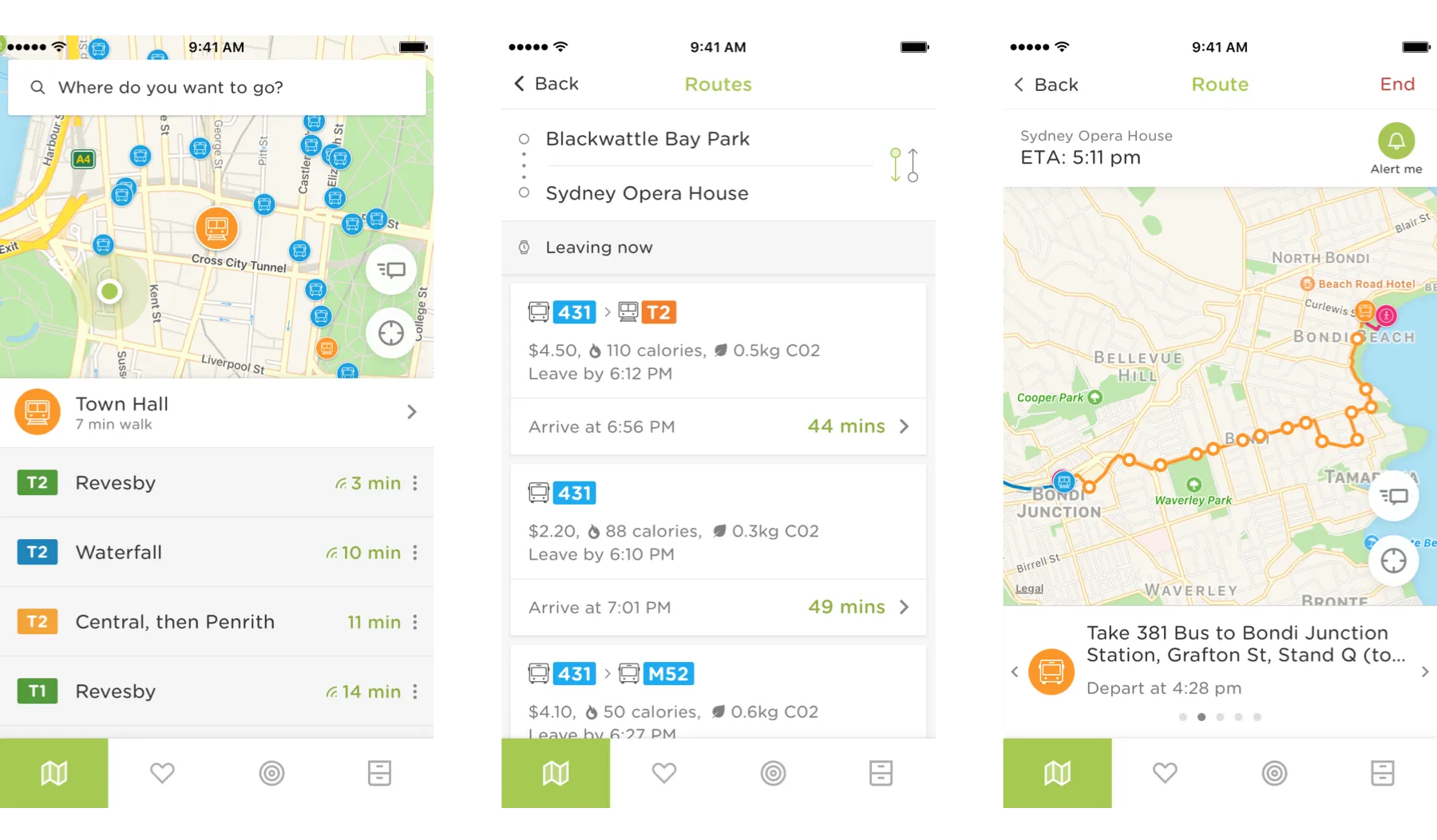
I’d hardly call it a ‘final’ design — because nothing’s ever really finished, but it was the first version we were truly satisfied with.
Part 2: Receiving some love from Apple & launching the Apple Watch app
Once we had a solid app, marketing was switched on (mostly social media) and people began to take notice. In only months Embark had over 100,000 registered users. This was partly thanks to no less than 3 features by Apple on the App Store.
For anybody who’s ever released an iOS app which has gained any kind of attention, you’re probably familiar with Apple’s process for featuring apps. They want to see that you’re abiding by their guidelines and you’re supporting Apple products as best as possible. This is what led us to creating Embark for Apple Watch, as well as adding support for Voiceover so that vision impaired people would be able to use Embark (these are by no means trivial tasks).
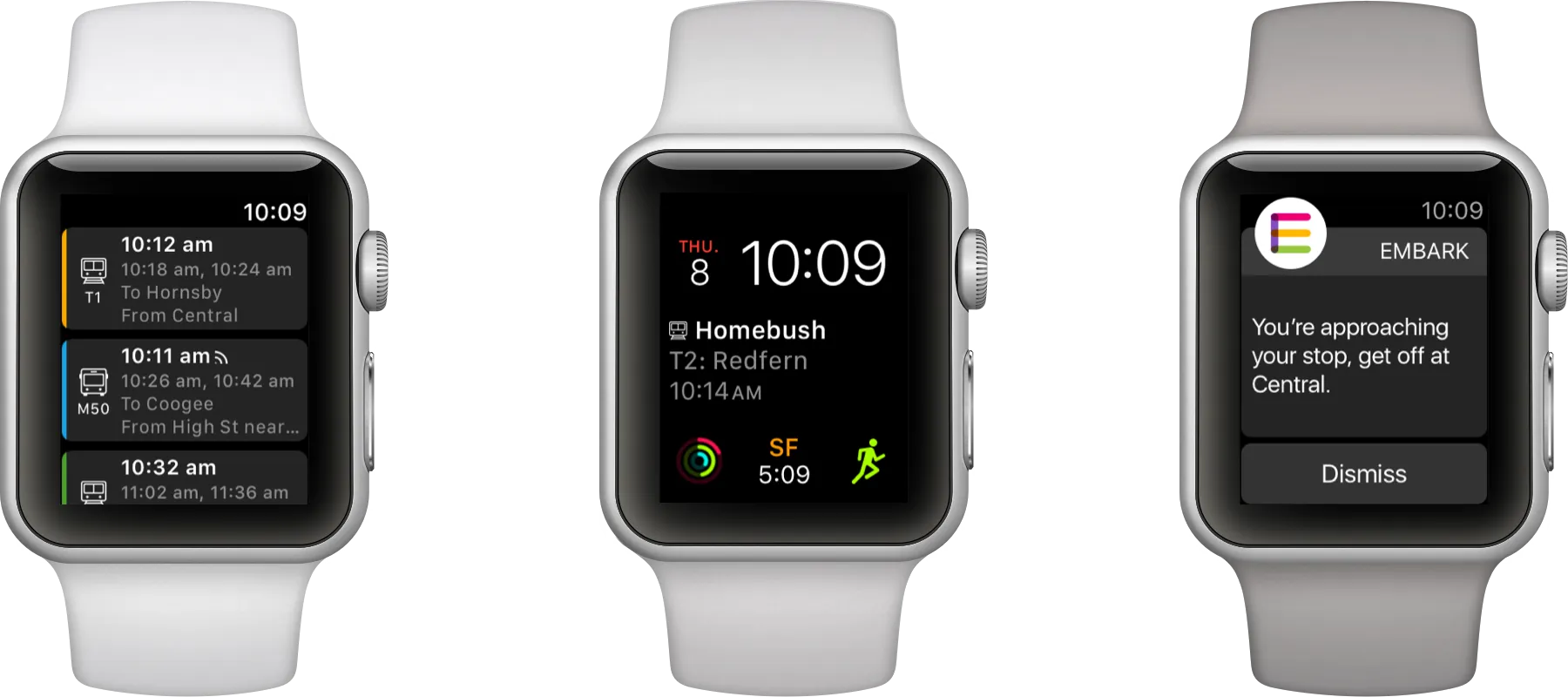
This was my first experience designing for the Apple Watch, and the biggest take-away I have from it is… Apple Watch apps are rubbish, but ‘complications’ are excellent despite their limitations.
To ensure the watch’s battery life survives a day, Apple places limits on the number of times you can refresh the data for a complication each day which makes designing for the watch a challenge for apps like Embark, where ideally we’d like to update every 5 minutes or so. The Apple Watch app for Embark was a much bigger job than we originally anticipated.
While designing the watch app we came up with the idea for stop alerts which would send users a notification when they were getting to their stop or station. This turned out to be a great feature addition that was well received by watch users in particular.
Part 3: Embark for Android
A few months after releasing Embark for iPhone we started getting bombarded with requests for an Android version. This was expected, but never-the-less it pushed us to get it out a bit faster. The Android version of Embark is pretty much the same as the iPhone version, with a few minor tweaks to make it more ‘Android’.
Afterword
This was a very brief look behind-the-scenes at some small phases of Embark’s design. There’s heaps more to it than what I’ve outlined here. Be sure to visit Embark’s website (which I also designed) and of course download the app!
Introducing the all new Marathon – the tool for people who live in Figma

AI Is Offering A New First Step To The Mental Health Journey

After the Interface: Rethinking Design for a World of AI Agents

Hill Has Been Accepted Into The HF0 Residency

Joining Hill As Head of Product
We turned 10 years of product design expertise into the ultimate AI design copilot

Breaking into UX & Product Design: A Guide for New Designers

Adding 'flexible features' to uncover new product opportunities

Introducing Blair, the companion to help you conquer your day

Pushing Through Creative Block: Learning from Artists and Musicians to Reignite Inspiration
We helped Eugen Rochko, founder of Mastodon, fix their onboarding experience

Unlocking Airbnb’s Secret: How SaaS Founders Can Aim For 10 Stars And Win

How to avoid MVP feature creep: The ICE Method
Introducing Mast: The project tool for design teams

Reflecting on my time running a 100-person creative community in the heart of Melbourne
Starting a company during a global pandemic, with Jeremy Blaze on Funemployed

Introducing NOOK: Digital Patron Check-In & Menus to Keep Australia's Hospitality Industry Afloat
Why I’ve started a product design studio

Case Study: Making sense of LIVE carpark availability in UbiPark
Enpose has been acquired by ApiLayer, solidifying their position in the screenshot API market
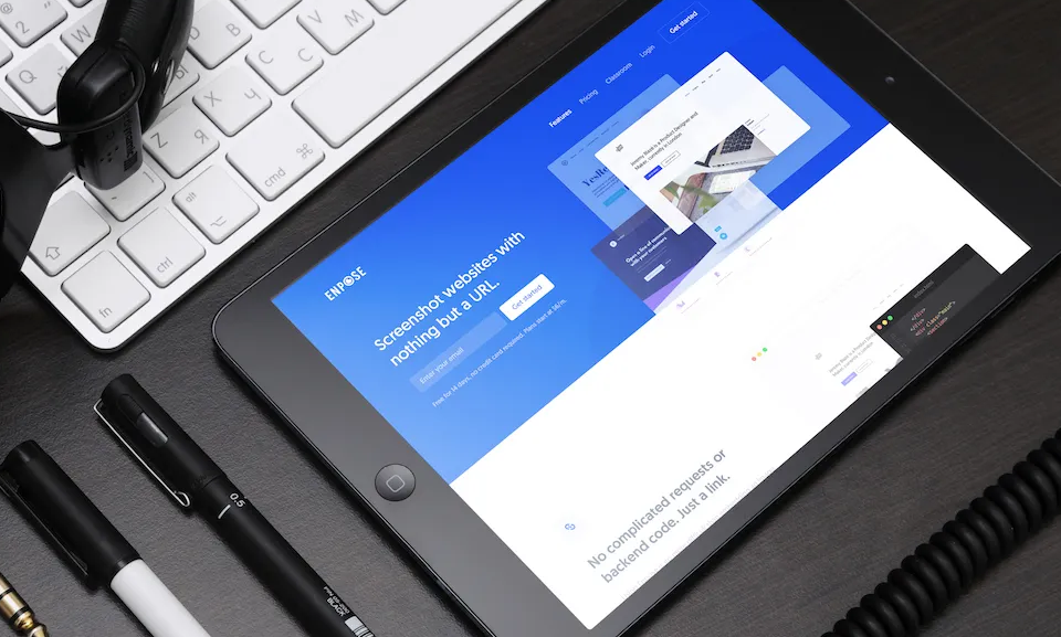
An exercise in reductive design: Building a beautiful API
