Case Study: Making sense of LIVE carpark availability in UbiPark
Introduction
UbiPark is helping people find spots to park, quickly. The team brought me in to assist in coming up with a way of displaying LIVE parking availability in their app. This brief had a few unique challenges mostly brought about by the nature of parking data.
Map-based design projects are always some of my favourite to work on as they provide unique challenges around data visualisation, usability and gesture interactions (you can’t have many on a map interface as the map itself uses such a wide array).
Here’s a brief overview of the project.
Key challenges
- We sometimes get data for individual carparks, and other times we just get it for a row of carparks
- Occasionally a row of carparks might have one disabled park, or perhaps a loading zone
- Different parking times need to be displayed, and we need to warn people if, for example, a carpark is about to become a clearway
Part 1: Deciding on what’s most important
Because of the inconsistency of the data, we had to work out what was most important to display as it’s unlikely it’ll be appropriate to display everything. This involved weighing up things like whether it was important to show individual parks, or just whether there’s at least 1 free park in a row of carparks.
In addition to more common problems like that, we had to work out whether we wanted to display loading zones, disabled parks, whether the park was about to become unavailable due to a time restriction etc.
Part 2: Solution number one
When I came onto the project I inherited a solution from a previous designer which can be seen below…
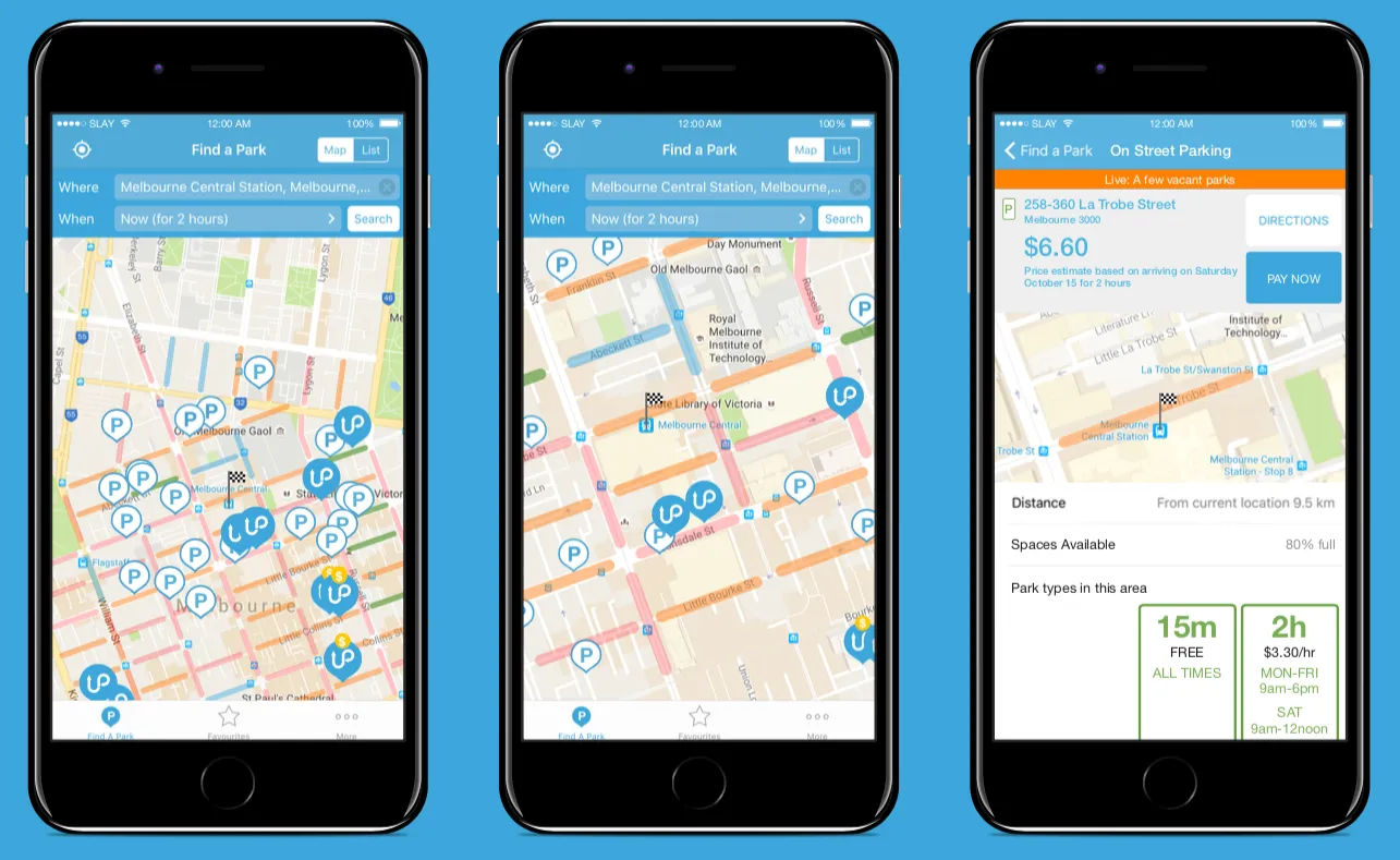
This served as a good starting point, but there were a few problems…
- It wasn’t clear that the rows of carparks were tappable
- The rows on each street only conveyed one piece of information: are there or aren’t there parks available
- If a carpark was about to become a clearway, there was no way of displaying this to users
To overcome these challenges, we came up with the following…
Unfortunately, this still wasn’t going to cut it. It had many of the same fatal flaws as before, with the minor improvement of showing the carpark’s time limit. A lengthy period of ideation ensued.
Part 3: Refining the concept & designing pins
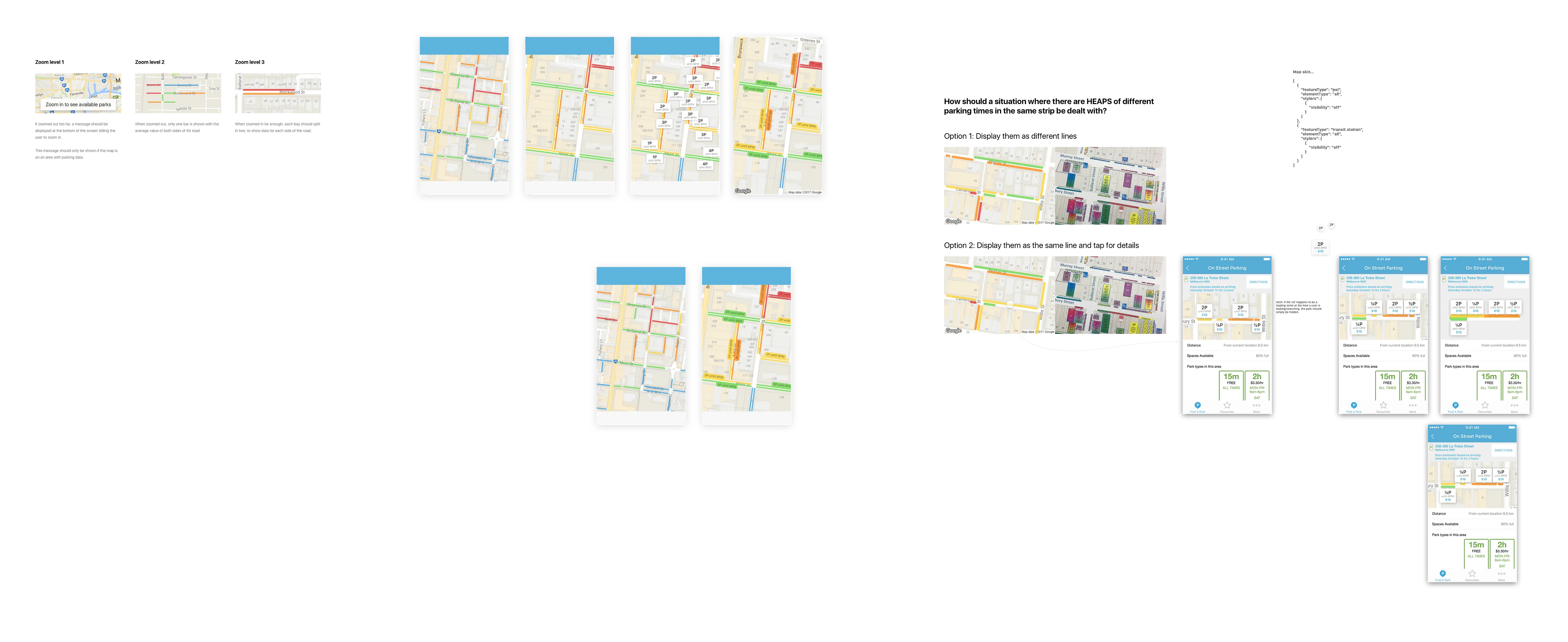
There were lots of problems which needed to be worked out to get to a solution. One of the more interesting ones was the style of the map pins.
We likely came up with 50 different ‘map pin’ styles alone. We prototyped various options on actual maps to work out which would be most visible at the most macro zoom level.
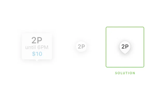
We settled on the solution to the right as it seemed to be most visible from afar and showed some additional information. Option one admittedly showed the most info, but its neighbours were always covering each other up to the point that nothing was readable. Option two we liked because it seemed to rarely overap with others, except it wasn’t clear which row of parks it referred to as there was no kind of arrow. Option 3 was awarded the ‘best-of-everything’ medal.
Part 4: Getting directions
In comparison with the other challenges of this project, this one was pretty tame. We decided to simply borrow an interaction from Uber here which served our purposes perfectly.
We wanted people to be able to easily get directions to a carpark they see is available. Rather than typing an address or tapping on a tiny tap target, we decided to go with a ‘move the map’ solution which you can watch below.
Here's the prototype Youtube video
Part 5: Putting it all together
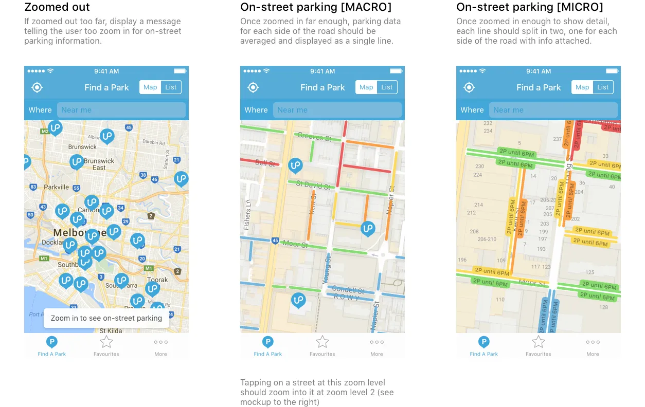
Now that the pin styles were sorted and we’d worked out how people would navigate to the carpark, there were still the constant challenges associated with displaying all the conditions of each parking space. We were sure we wouldn’t be able to display everything all the time, so we had to work with the different map zoom levels and just show as many of the important data points as we could.
This brings us to the final design…
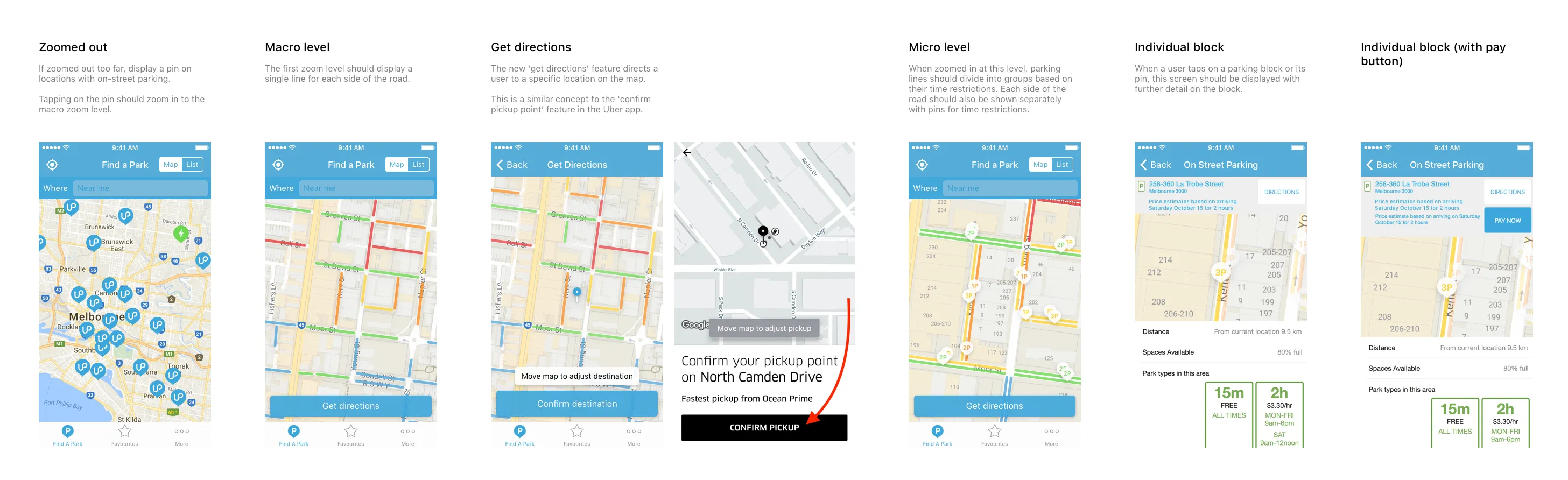
In order to get around the issue of not being able to show individual parks, we decided in the end to average out the data at higher zoom levels so that we could show some info and then gradually add in more detail as the user zooms in which can be seen above.
The final solution was by no means perfect, but serves as a valuable MVP to take the new feature to market where UbiPark will be able to conduct user testing, get some insight into where it can be improved and continue to work on perfecting the feature.
If you’d like to read about another map-based UX project I’ve worked on, check out my case study on Embark. I’m also available for hire as a Product Designer – you can contact me via my website.
I recently launched a product design collective working exclusively with early stage startup companies. Check it out at neverbeforeseen.co ;)
Introducing the all new Marathon – the tool for people who live in Figma

AI Is Offering A New First Step To The Mental Health Journey
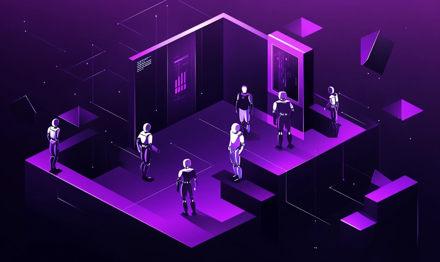
After the Interface: Rethinking Design for a World of AI Agents
Hill Has Been Accepted Into The HF0 Residency

Joining Hill As Head of Product
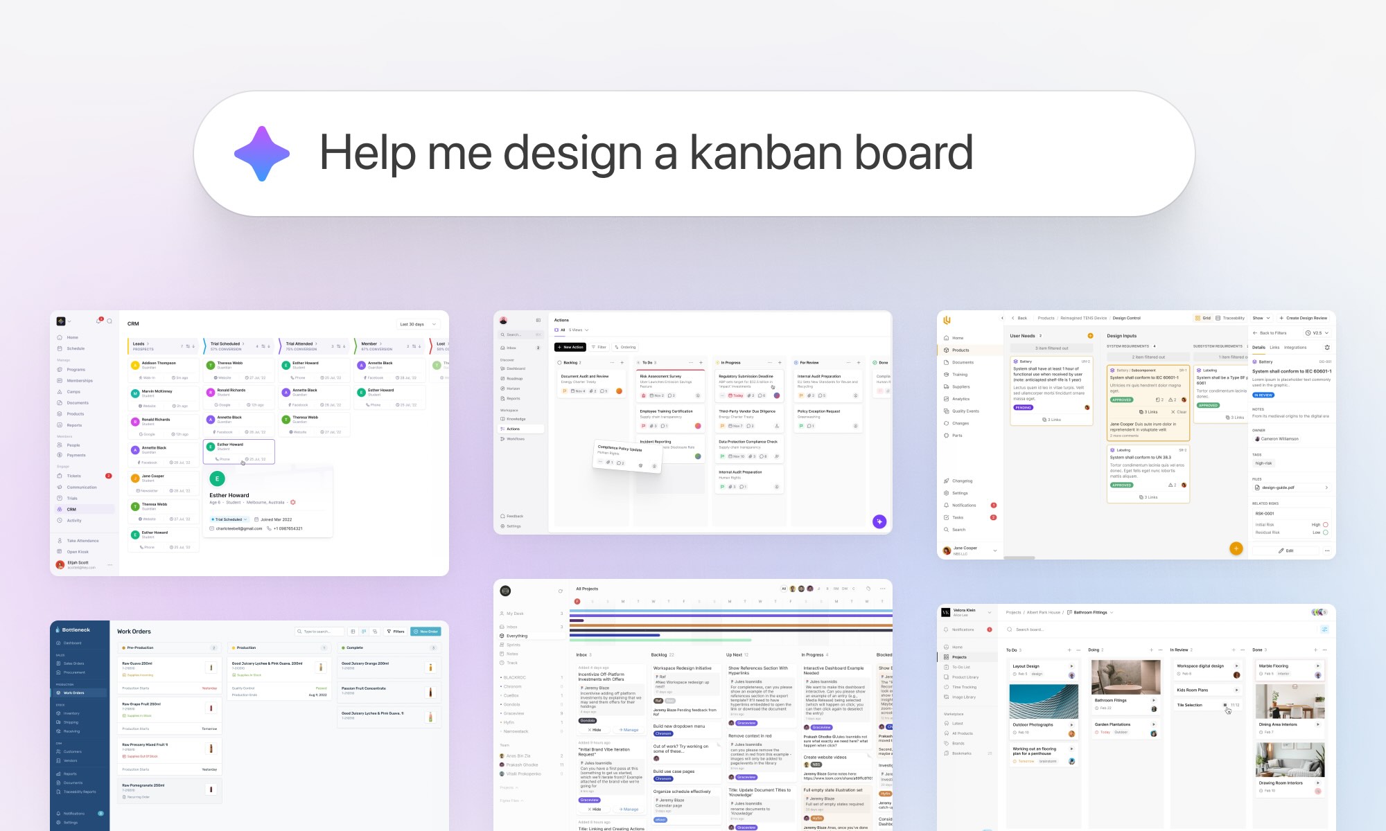
We turned 10 years of product design expertise into the ultimate AI design copilot

Breaking into UX & Product Design: A Guide for New Designers
Adding 'flexible features' to uncover new product opportunities

Introducing Blair, the companion to help you conquer your day

Pushing Through Creative Block: Learning from Artists and Musicians to Reignite Inspiration
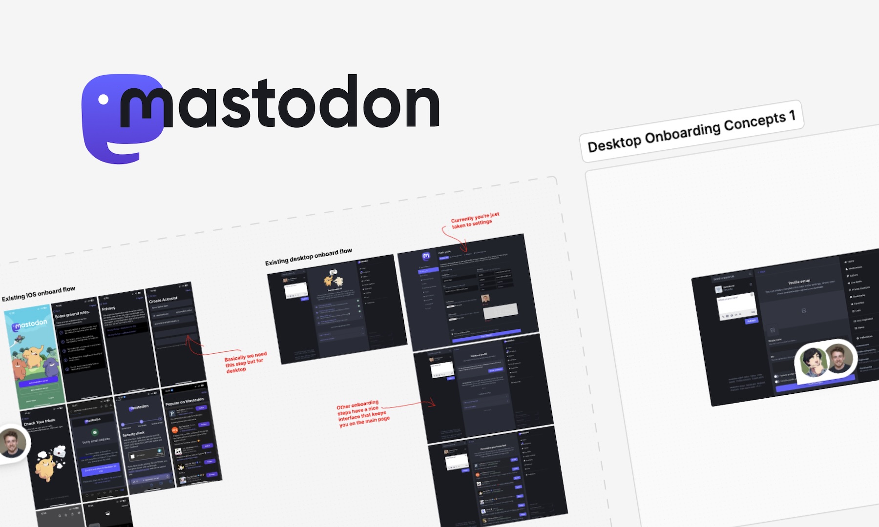
We helped Eugen Rochko, founder of Mastodon, fix their onboarding experience
Unlocking Airbnb’s Secret: How SaaS Founders Can Aim For 10 Stars And Win

How to avoid MVP feature creep: The ICE Method
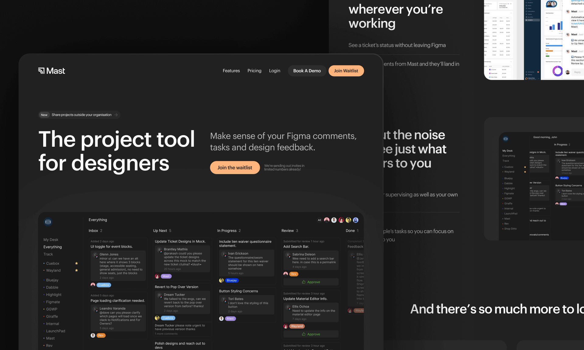
Introducing Mast: The project tool for design teams

Reflecting on my time running a 100-person creative community in the heart of Melbourne
Starting a company during a global pandemic, with Jeremy Blaze on Funemployed

Introducing NOOK: Digital Patron Check-In & Menus to Keep Australia's Hospitality Industry Afloat
Why I’ve started a product design studio
Case Study: Embark’s design, launch & early iteration
Enpose has been acquired by ApiLayer, solidifying their position in the screenshot API market
An exercise in reductive design: Building a beautiful API